Font
Choose the font, size, color, shadow, alignment, and text animation.
What the Font tab is for
The Font tab is for customizing how your captions look and setting the text entrance animation. Here you can choose the font, size, color, and other settings.
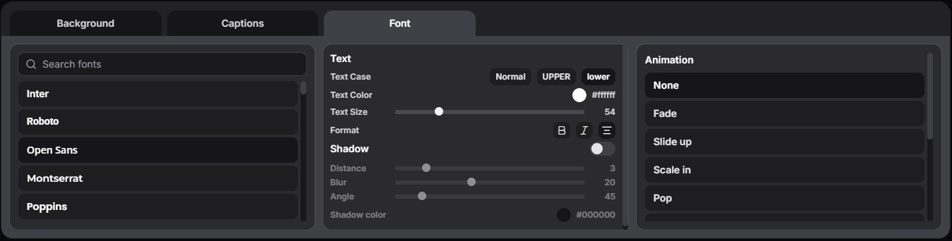
Most settings are familiar to anyone who has worked with text in graphic editors. Let’s look closer at Shadow and Animation.
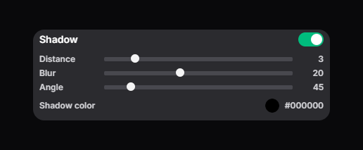
Shadow
Enable shadow and adjust:
- Distance - shadow offset from the text
- Blur - shadow blur
- Angle - shadow offset angle
- Shadow color - shadow color
Animation
Animation defines how a caption line appears:
- None - no animation.
- Fade - smooth fade in. The text gradually appears from transparent.
- Slide up - appears from below. The text slides up while fading in.
- Scale in - appears with scale. The text starts at 80% and scales to 100% while fading in.
- Pop - bouncy pop. The text appears quickly, slightly overshoots the scale (up to 106%), then returns to normal - it creates a “pop” effect.
- Blur in - appears with blur. The text starts blurred and lower, then becomes sharp and moves into its final position.
- Wipe up - wipe from bottom to top. The text is revealed from bottom to top, like a curtain going up.
- Shake - appears with a shake. The text appears, then quickly shakes left-right a few times and stops.
- Glow - appears with a glow. The text shows up with a growing glow around the letters.
- Bounce - bounce. The text softly bounces up and returns to its place.
- Typewriter - typewriter. The text appears from left to right, like typing - the right side is gradually revealed.